
So you’ve been using Dradis for a while (or maybe you’re a new user — welcome to the community 👋), and you’ve been avoiding the Plugin Manager because it’s been a little intimidating. Its purpose may not have been clear, and the relationship between the Plugin Manager, uploading files, the Rules Engine, and what ends up in a project may have been fuzzy. You uploaded some scanner results, dove into your project, and realized things didn’t appear as expected. Now you’re clicking around trying to figure out what went wrong. Sounds familiar? We’ll admit the Plugin Manager caused some confusion, but you’re in for a treat with Dradis Pro v4.4.0!
We took action to smooth out the friction
Since most of the mystery and confusion seems to be around how changes in the Plugin Manager affect projects and reports, we decided to add a way for users to validate their Plugin Manager configurations. This validation happens on a per-tool basis against any report template uploaded to Dradis. Let’s dive into some of the changes we made and the thought process behind some of those changes.
Improvements to the user interface
Before building out this new feature, we had to figure out where it would live. While deciding on that, we also determined it would be a great time to tidy up the Plugin Manager layout.
When users first landed on the Plugin Manager view, we presented them with some explainer text and an example of how tool output translates to a Dradis note. This wasn’t terrible, but it wasn’t exactly super helpful or welcoming.
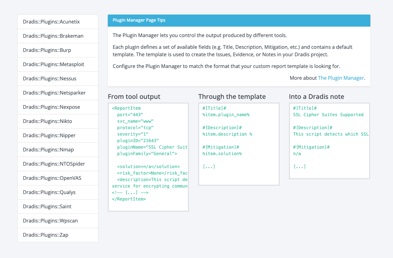
Some of the issues we identified and set out to improve here were:
- Parts of the copy were confusing
- The example section wasn’t clear to first-time users
- Users didn’t have a sense of direction (what do they need to do next?)
- The plugins menu was not labelled or explained (users had to explore by clicking)
- The layout wasn’t very consistent with other views in the app
We decided to shuffle the layout around a little to tackle these points and make it more consistent with other views. Most of our views have a page title, the main content area and a sidebar, so we wanted to implement that here as well. Here is an early mock-up with some changes added with a fat marker (Title, subheading, section headers, and a sidebar with some tips).
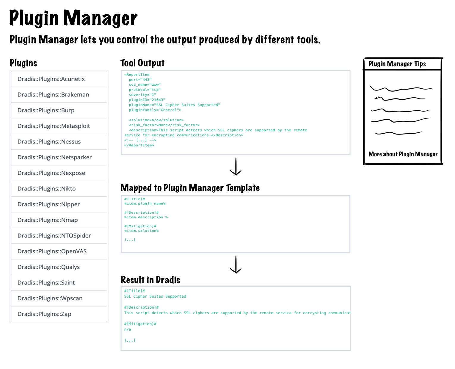
Overall, the plan was to:
- update the copy and move it to a tips panel in the sidebar
- change the example section to a vertical layout with some arrows added to show the flow of stages in the process
- update the headings of the three stages in the example section to make them clear
- add a header to the plugins menu
- add some copy (not pictured above) to direct the user to select a plugin from the menu on the left
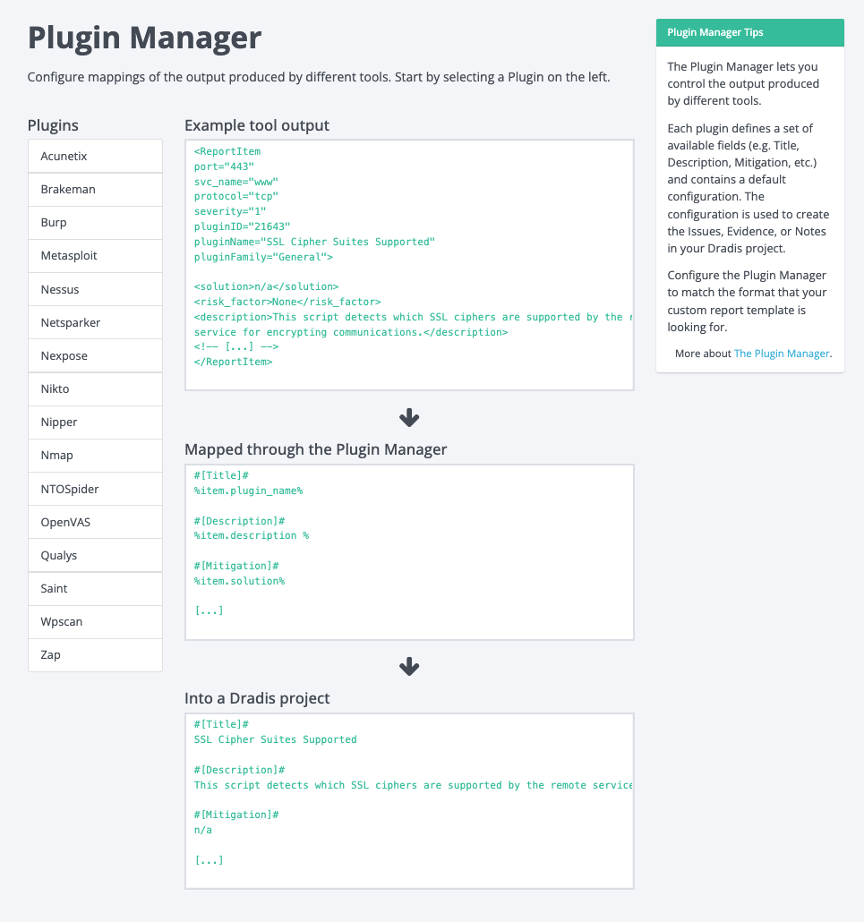
These changes would bring consistency to the view, enable the user to quickly understand the relation of the three stages in the example, and give the user some direction as to what to do next. This design addresses all five issues we wanted to improve, so we started implementing these changes, and this is the new view as a result:
Addition of Plugin Manager Validation
So far, the above changes are fine and dandy, but they still don’t help users bridge the gap between what they expect in their projects and what they get. This is where the shiny new validation feature comes in.
The idea was to allow users to edit their plugin manager configurations and show them how it will jive with their report template of choice. The validation feature would work by having users select a plugin and a report template. It would show which fields are mapped correctly and which fields are missing. We had internal discussions about the best approach and where we could incorporate validation into the Plugin Manager. Initially, we thought about adding the validation section to the main Plugin Manager view, but we quickly decided against that and thought about a new view dedicated to this new validation feature:
This is the first look at the validation feature design and components. We’ll get into the details a little farther down, but the overall idea is that users select a plugin, select a report template, and they see what’s mapped correctly and what’s not.
This view would show all things related to the validation of the selected plugin, and at first, it seemed like it would work in terms of layout. The view would be consistent with other related views, it would give users all the validation functionality, and it would allow users to edit the plugin’s configuration. However, after further design work and discussing with the team, we realized this implementation would be pretty annoying for users. It would require users to make an edit, come to this validation view, check their validation, realize they need to make further edits, go back to editing, then come back here to re-check their validation… you get the idea, way too much clicking around to get one thing done so back to the drawing board.
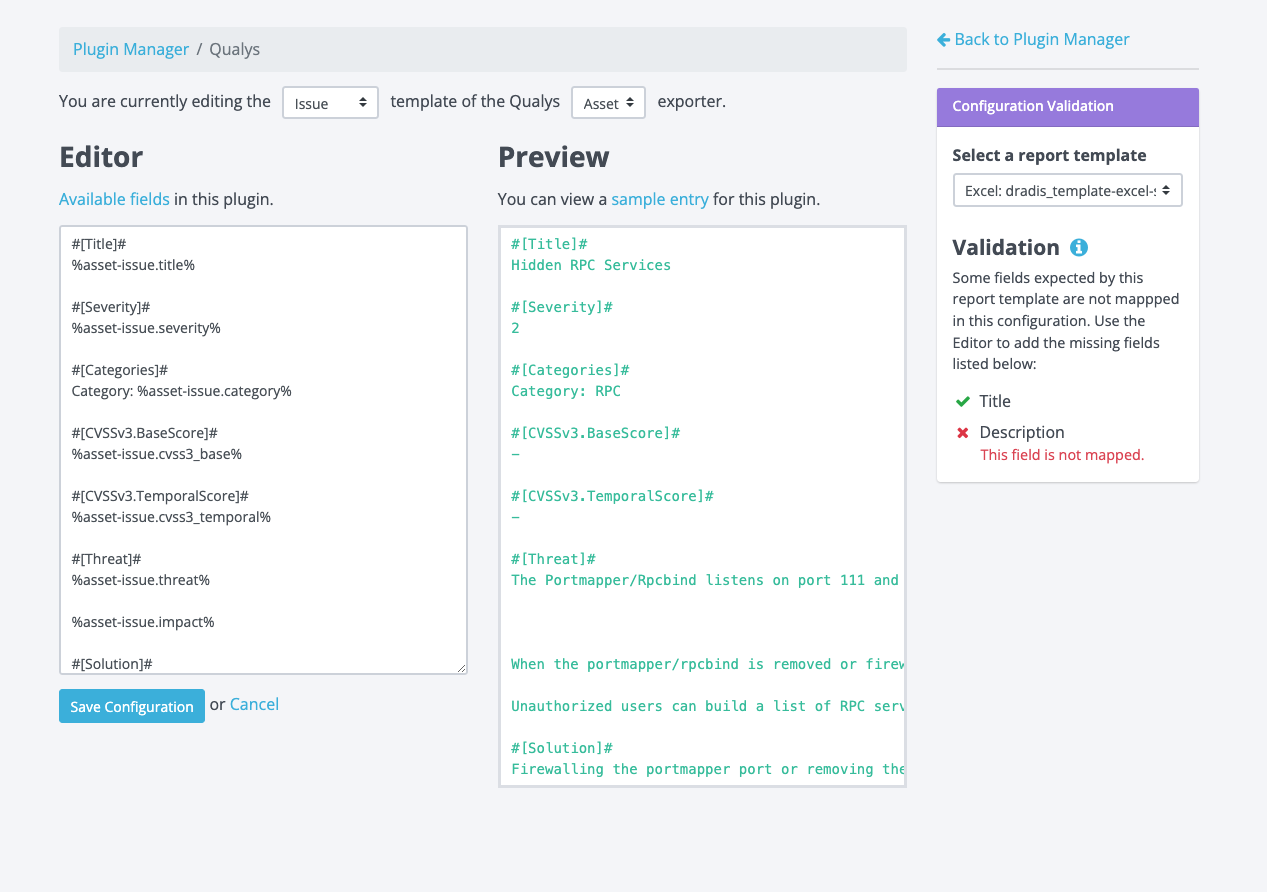
Rather than making users navigate away from the validation view to make the edits to the configuration, we figured why not bring the validation feature to the edit view? Another upside of having validation added to the edit view is that we would eliminate the need for users to select which plugin they want to validate. Here is a screenshot of the current edit view for reference:
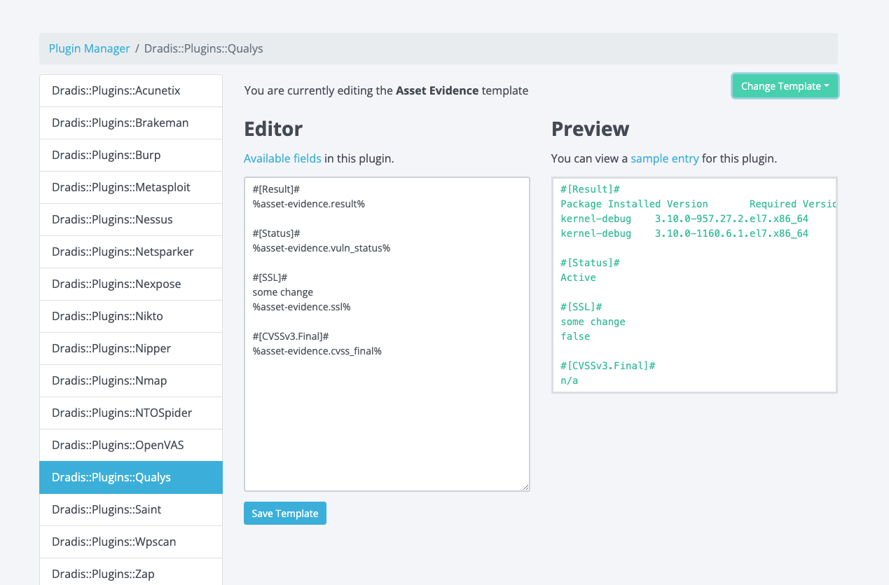
It’d be pretty crowded if we just dropped that validation section into this view, so we knew we had to make further refinements to the design.
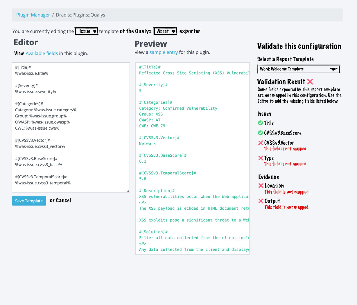
We also had to consider cases where there could be multiple exporters for the selected plugin (i.e. Qualys has Asset, Vuln, and WAS), and each of those exporters could have templates that map to Issues, Evidence, or Notes in Dradis Projects. It can be a bit of a guessing game to know which template maps to issues, notes, or evidence. Here is an example:
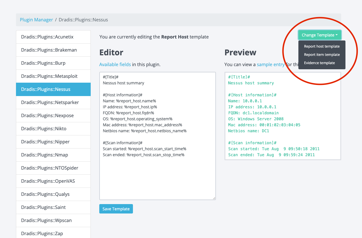
The image above shows that Nessus has Report host, Report item, and Evidence templates. Users can guess that Nessus Evidence maps to Evidence in Dradis projects, but what about Report Item or Report Host? We decided to get rid of the guesswork for users. Let’s jump into an early mock-up with some fat markered changes:
This design iteration would:
- Remove those long prefixes in the plugins menu to give us some more real estate to work with
- Add a selector for Issue, Evidence, and Note (where applicable). This selector makes it easier for users to determine where things will end up in Dradis Projects; no more guessing!
- Add the validation feature to the sidebar. This is a more condensed version of what we designed initially, but all of the same info is there, just arranged in a way that would be more effective in a sidebar format.
It’s a good general direction, but dissecting this further, we didn’t like that the preview is now stacked under the editor. This is awkward and inconsistent with every other view where we show previews. This also makes for awkward placement of the save button.
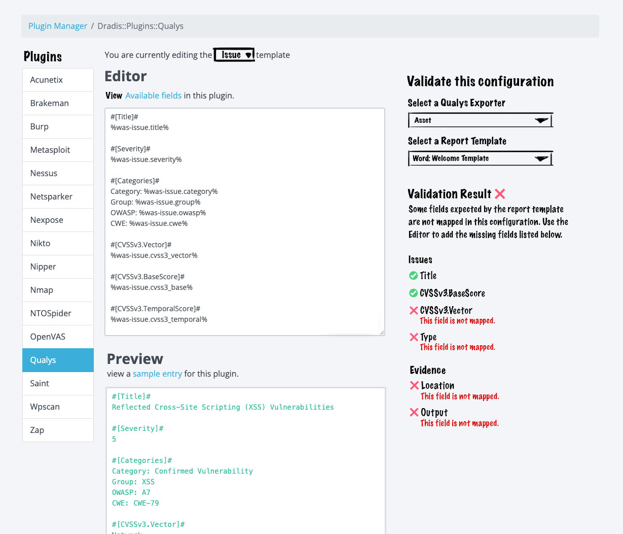
Enter the final design iteration:
We really wanted the editor to be side by side with the preview, but we needed some more space to make the editor and preview usable. Ultimately, we decided to trade the plugin menu on the left for that extra space. Removing the plugin menu enabled us to have the side-by-side layout we wanted. The keen observer may have noticed that this design moves the exporter select menu out of the validation section and into the main content area. We made this change here because users not concerned with validation would still need to select the exporter if they wanted to make edits in the editor. The validation feature is only really concerned about which report template users wish to validate against.
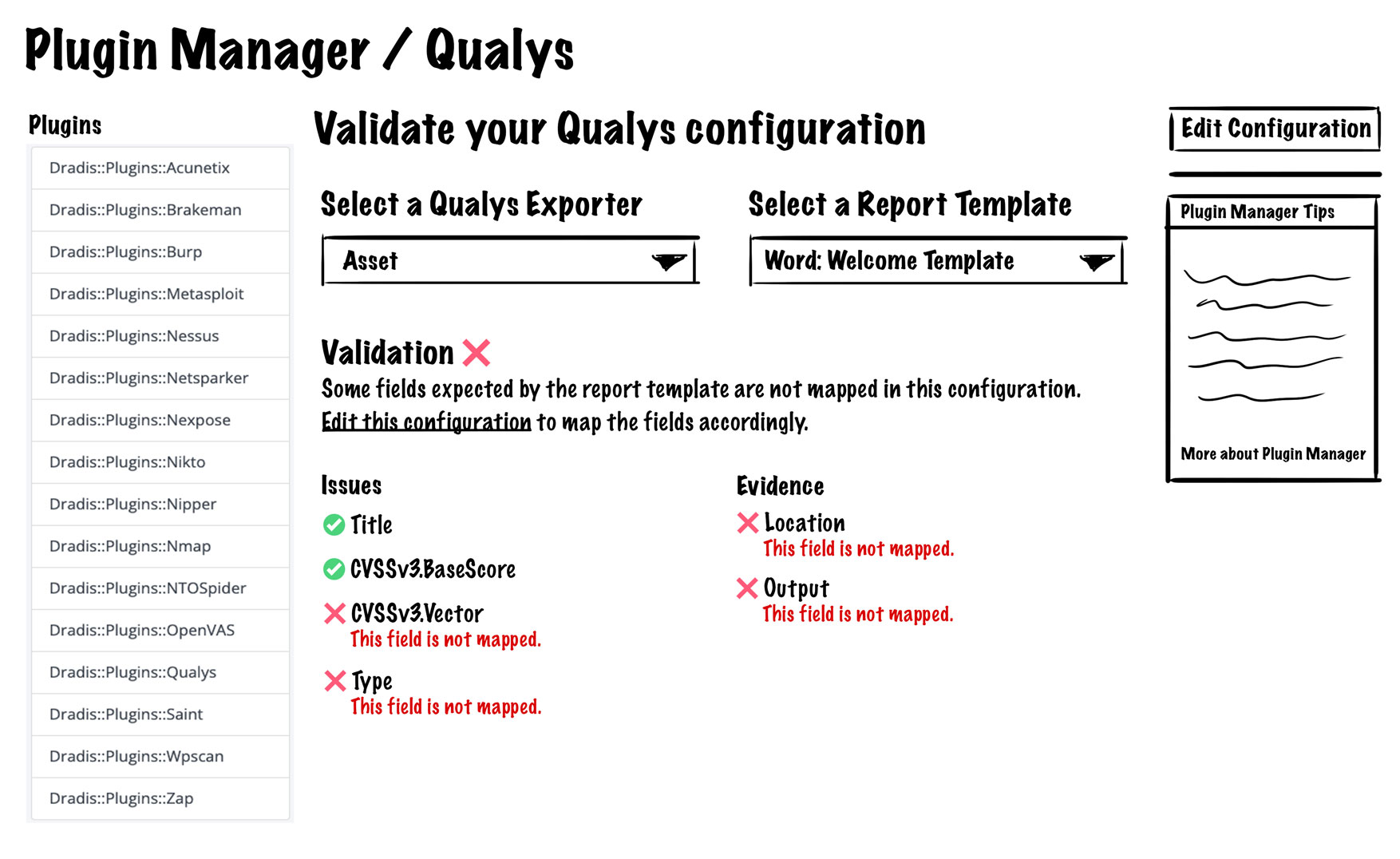
After a few more minor tweaks, we implemented this design and got this final result:
Users are now able to:
- Differentiate between Issue, Evidence, and Note templates
- Differentiate between multiple exporters
- Validate that all fields are mapped accordingly
How to validate your configuration
Now that we have this awesome new feature, let’s take it for a spin. Let’s say you have a report template with some issue/evidence fields defined and your plugin of choice is Burp.
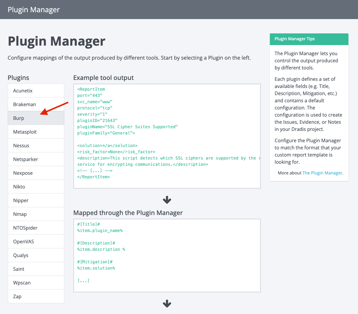
Head over to the Plugin Manager and select Burp from the plugin menu:
Select the template you want to validate:
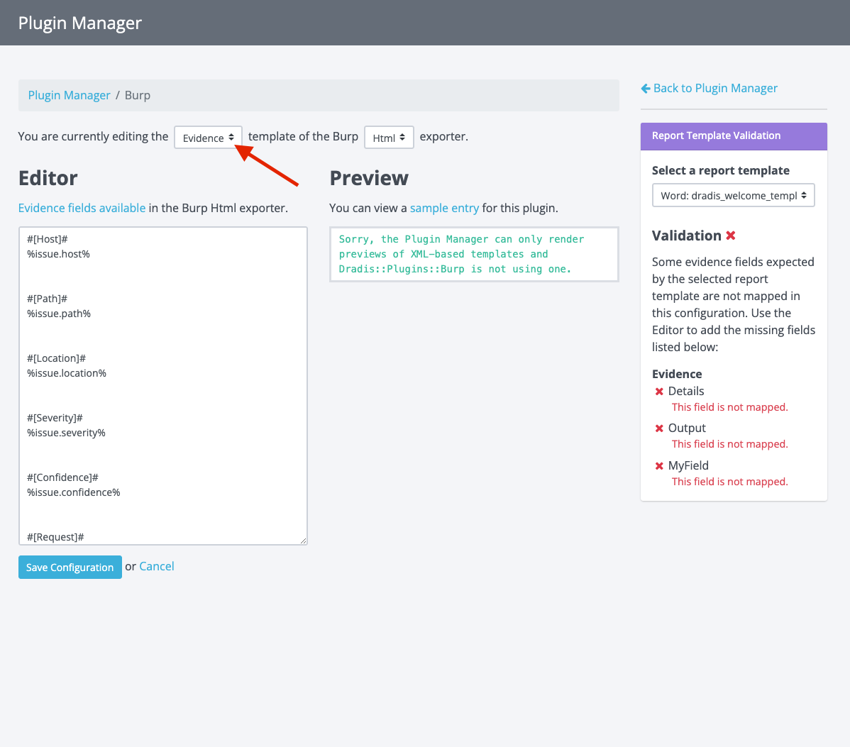
Then select the exporter (if there are options):
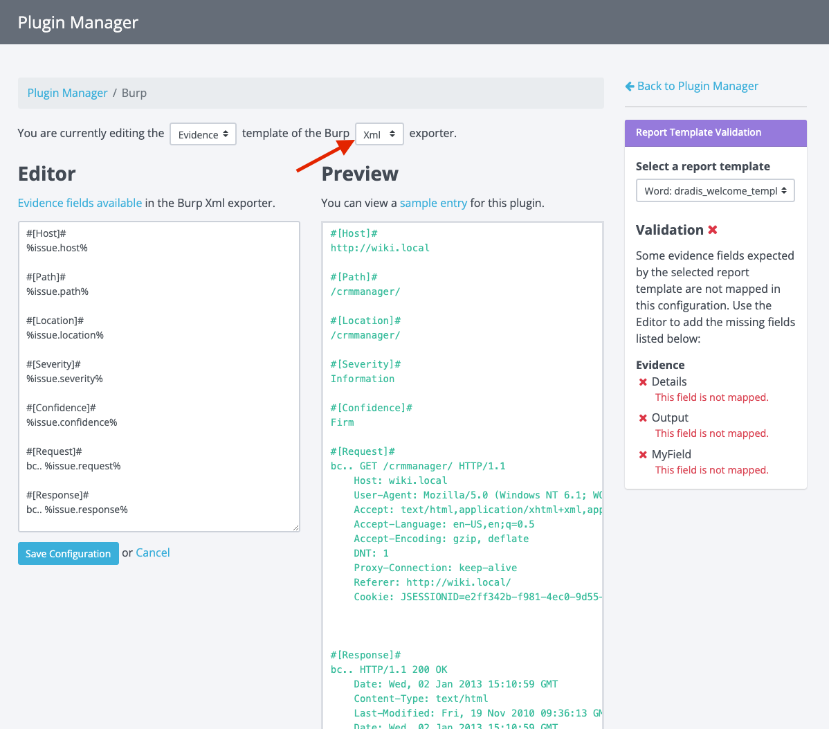
At this point, you will see the selected plugin’s template content and a preview of how it would appear based on some sample Burp output.
Now you can select a report template in the Report Template Validation panel:
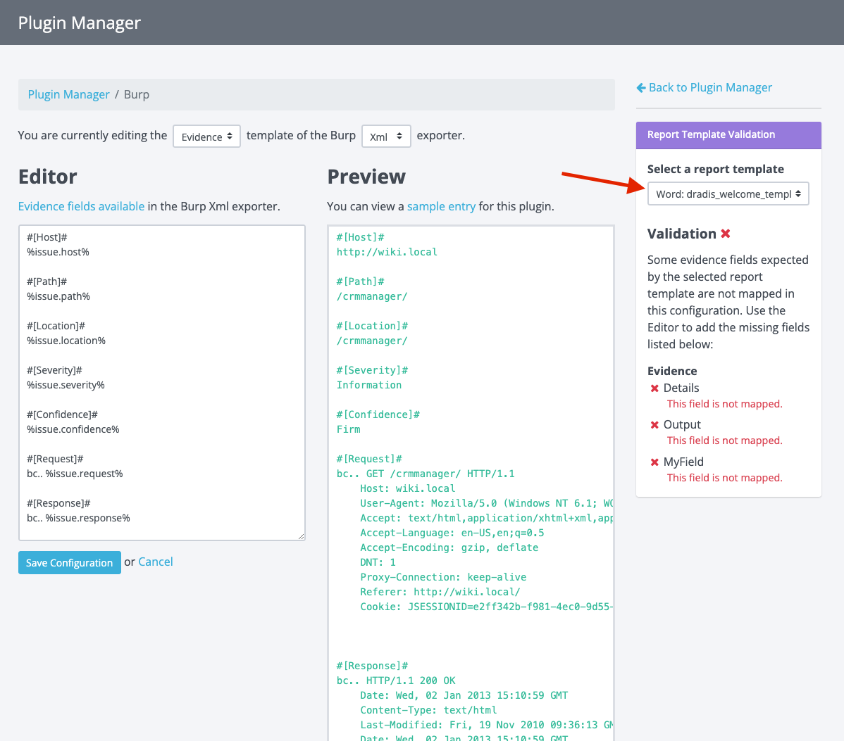
A validation check will now be executed, and you will see if any fields are not mapped as expected by the report template you selected. From here, you can make edits in the editor to add those missing fields. As you type, you will see the validation panel update in real-time to show you if the configuration passes validation.
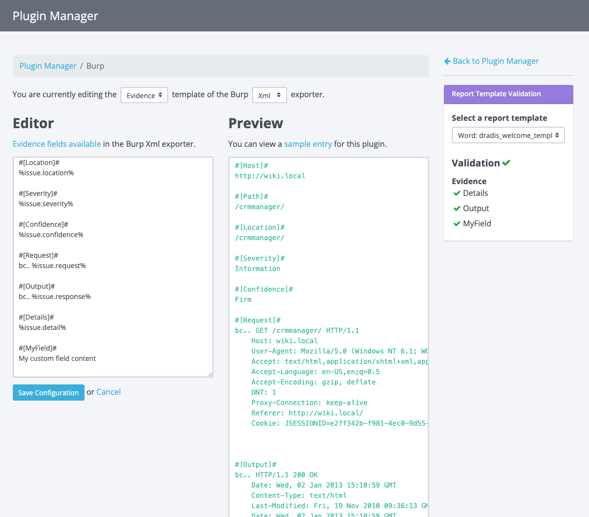
Once you see a green validation checkmark, your configuration is valid. You can start importing tool output into Dradis and exporting reports knowing that fields will appear as expected.
Pretty cool, right?
But wait, there’s more!
Earlier in this blog post, I mentioned that the Rules Engine is involved in all of this, but we haven’t touched on it yet. If you’re not familiar with the Rules Engine, it can be used to manipulate the plugin output before it imports everything into a project. For example, based on user-defined conditions, the Rules Engine can do things like:
- Replace the description that comes from the plugin output with a custom description
- Change the risk rating
- Delete a finding
- and much more.
Here is an example of a Rule being created in the Rules Engine:
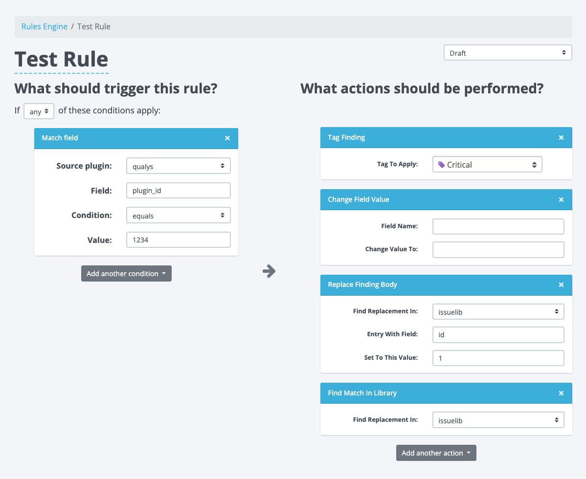
We have the condition that has to be met on the left and the actions that will be executed on the right.
Up to now, when building conditions, users would have to manually enter the field that the condition would check, but this required knowledge of the plugin manager configuration. This was also prone to user errors as the field name had to exactly match a field in the plugin manager for the selected plugin. Considering that we already have these fields in Plugin Manager, there is no reason to put this burden on the user.
With the changes to Plugin Manager, this seemed like a great time to update the Rules Engine and do something about that pesky field input.
Another issue we tackled was the scalability of this view. With the 2-column setup (conditions on the left and the actions on the right), we found that the arrow in the center would often get misaligned. This arrow guides the user’s flow from one side to the next, but when it gets misaligned, it becomes hard to understand and sometimes, it may even add confusion.
Keeping the above in mind, we set out to design some changes. We wanted to ensure the view could scale well, accommodating both small and large numbers of conditions and actions for each rule. After some experimenting, we decided to flip the layout into a top-down orientation to give it more of a timeline or story-like feel that paints the complete picture for users.
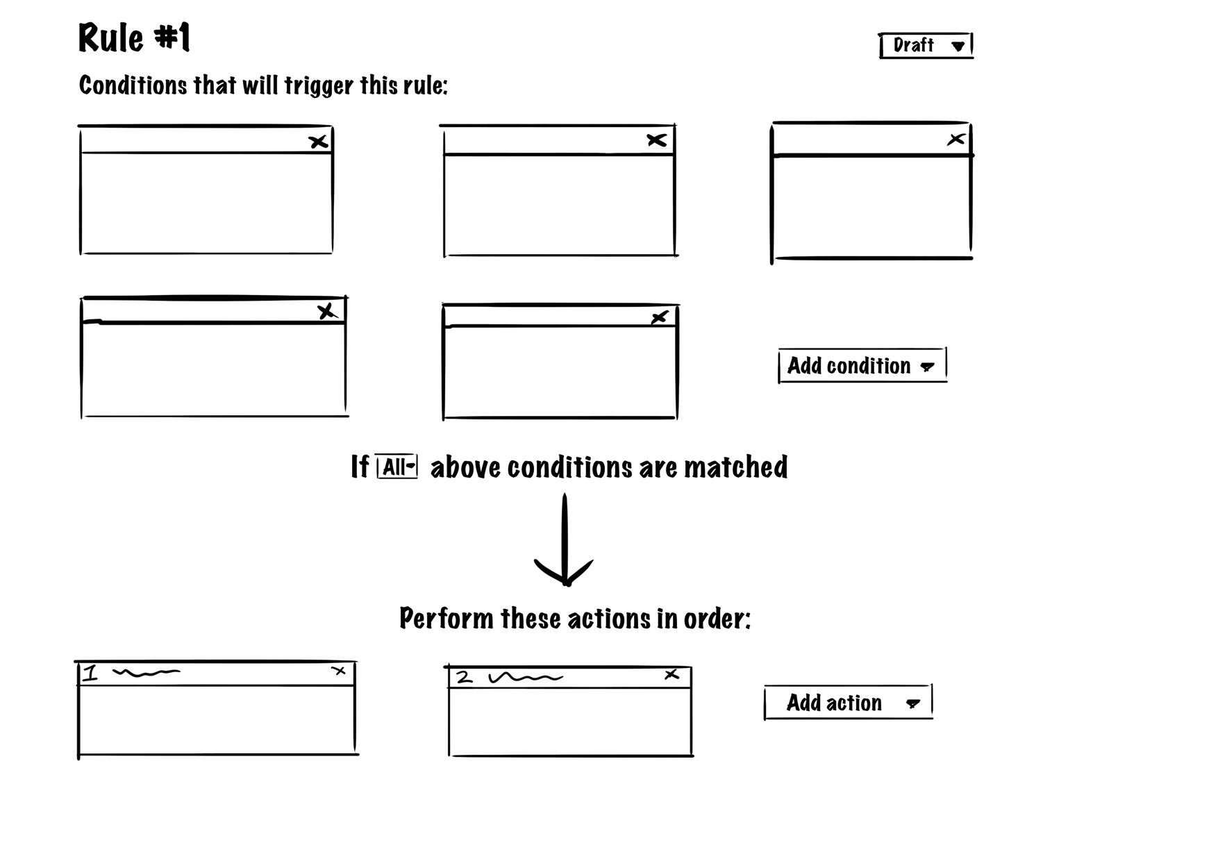
The view would list all conditions at the top, and as users transition their attention down the page, they would flow into the actions. We added some copy to guide the users between the conditions and actions. This layout scales well because regardless of how many conditions and actions there are, nothing gets misaligned and everything stays grouped together. Users start with their attention at the top, then transition towards the bottom with everything they need in between. We gave this design the green light, and after some further tweaks to the design, this is the implementation:
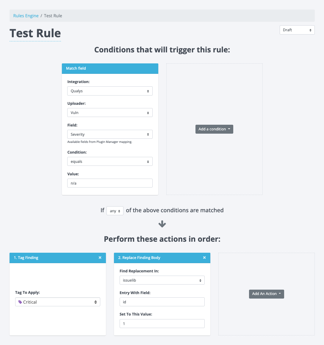
During this updated layout implementation, we also updated the condition boxes. They now have an uploader select to differentiate between the different uploaders a plugin may have (similar to the exporters in Plugin Manager). In addition, the field input has been replaced by a field selector. This Field selector lists all the possible fields based on the corresponding plugin manager configuration. Now users can simply select available fields without knowing what they are ahead of time or ensuring they don’t mistype anything. The action boxes largely remained the same with just a minor tweak to the headers where we now number the actions to convey the order of the actions executing.
Give it a whirl
All of these changes combined make for an easier UI to follow and a less complex UX to upload scanner output, map the fields to Dradis in the Plugin Manager, process the data through the Rules Engine, and get the desired results in projects.
Give v4.4.0 a go and test out these new features yourself. Feel free to experiment with them and share your feedback with us. We’d love to know how you like this new validation feature in the Plugin Manager and the updates to the Rules Engine.
Happy Hacking ✌️
Matt