As a designer, sometimes there are small details that bother me to the point where I need to address them. This time it was the Dradis logo that fell victim to my designer eye for details. A little while ago, I noticed something was amiss with the logo’s 3D perspective. When we started using the logo as the favicon, I noticed that one side appeared to be significantly narrower than the other.
Additionally, the logo’s current style doesn’t scale well. When the logo is significantly scaled-down we lose the outlines which cause the extruded sides to blend into the top face, skewing the design.
Let’s dissect the logo to investigate and fix the perspective and symmetry problems. While we’re at it, let’s also address the scaling issue.
Investigation
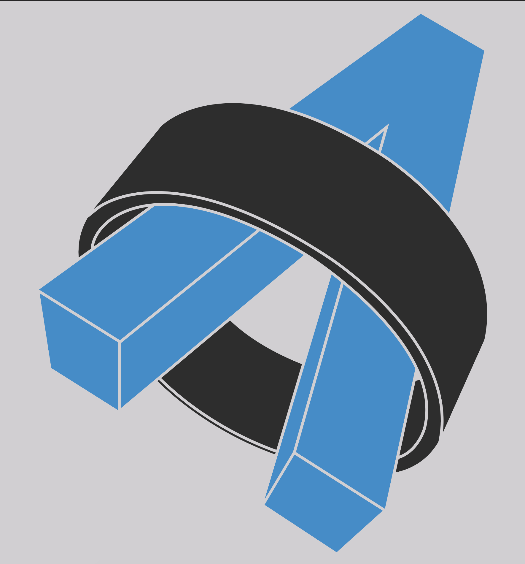
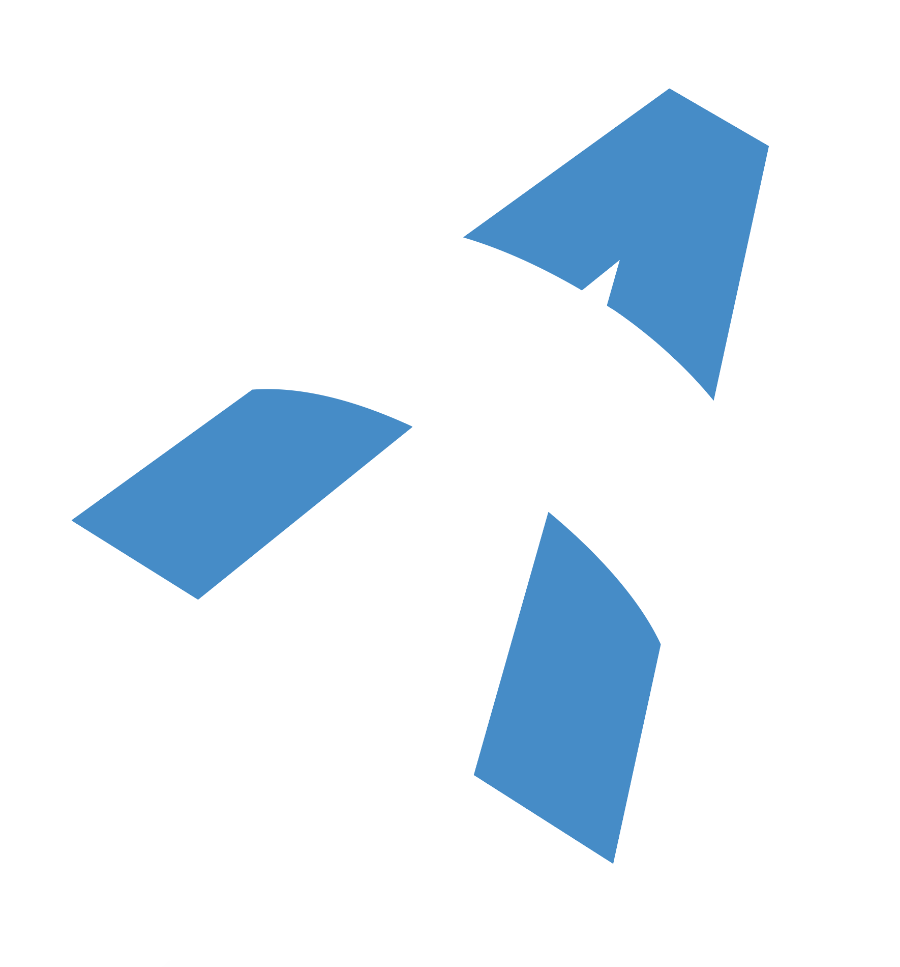
Jumping right into it, let’s take a look at the current logo:
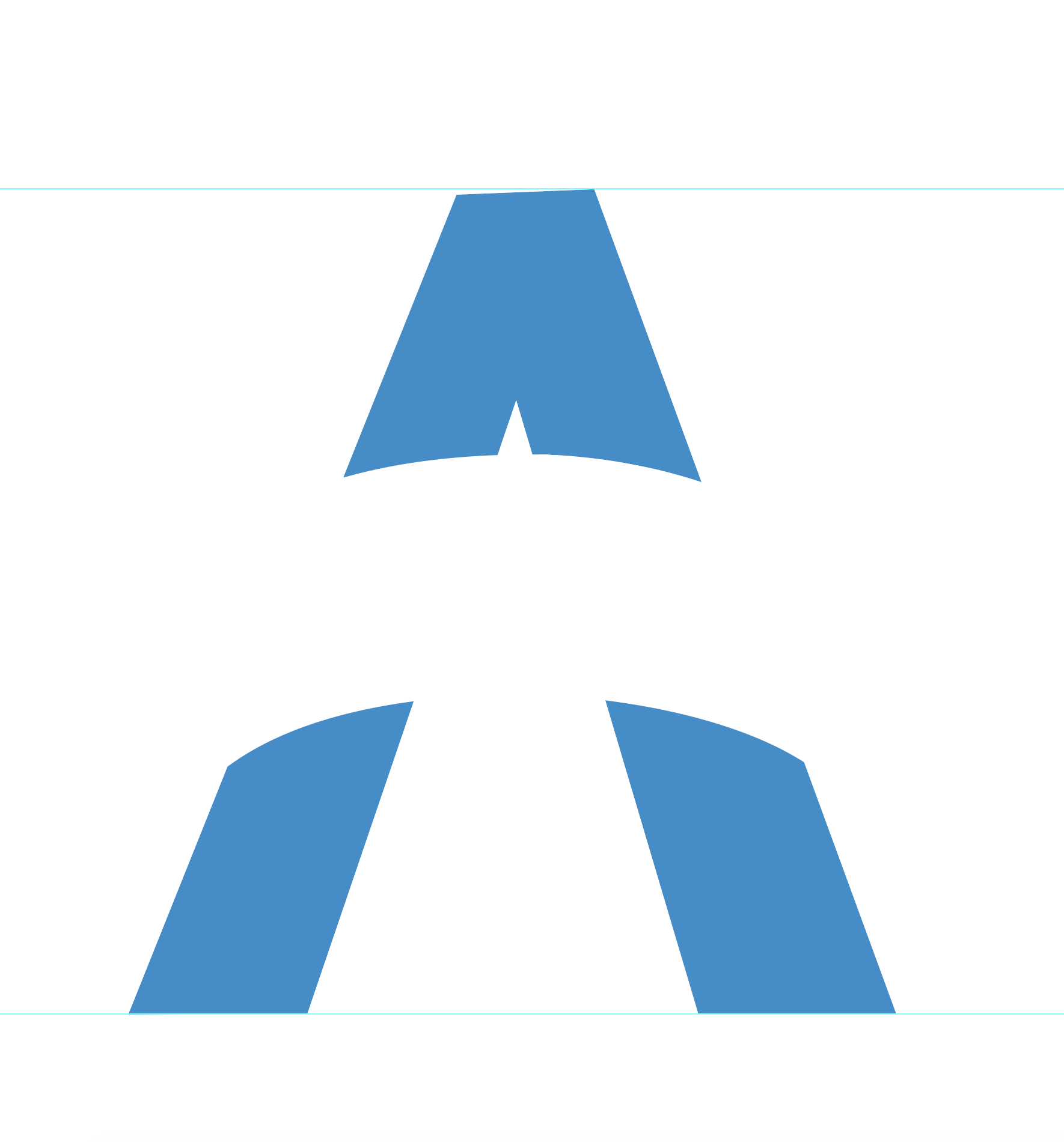
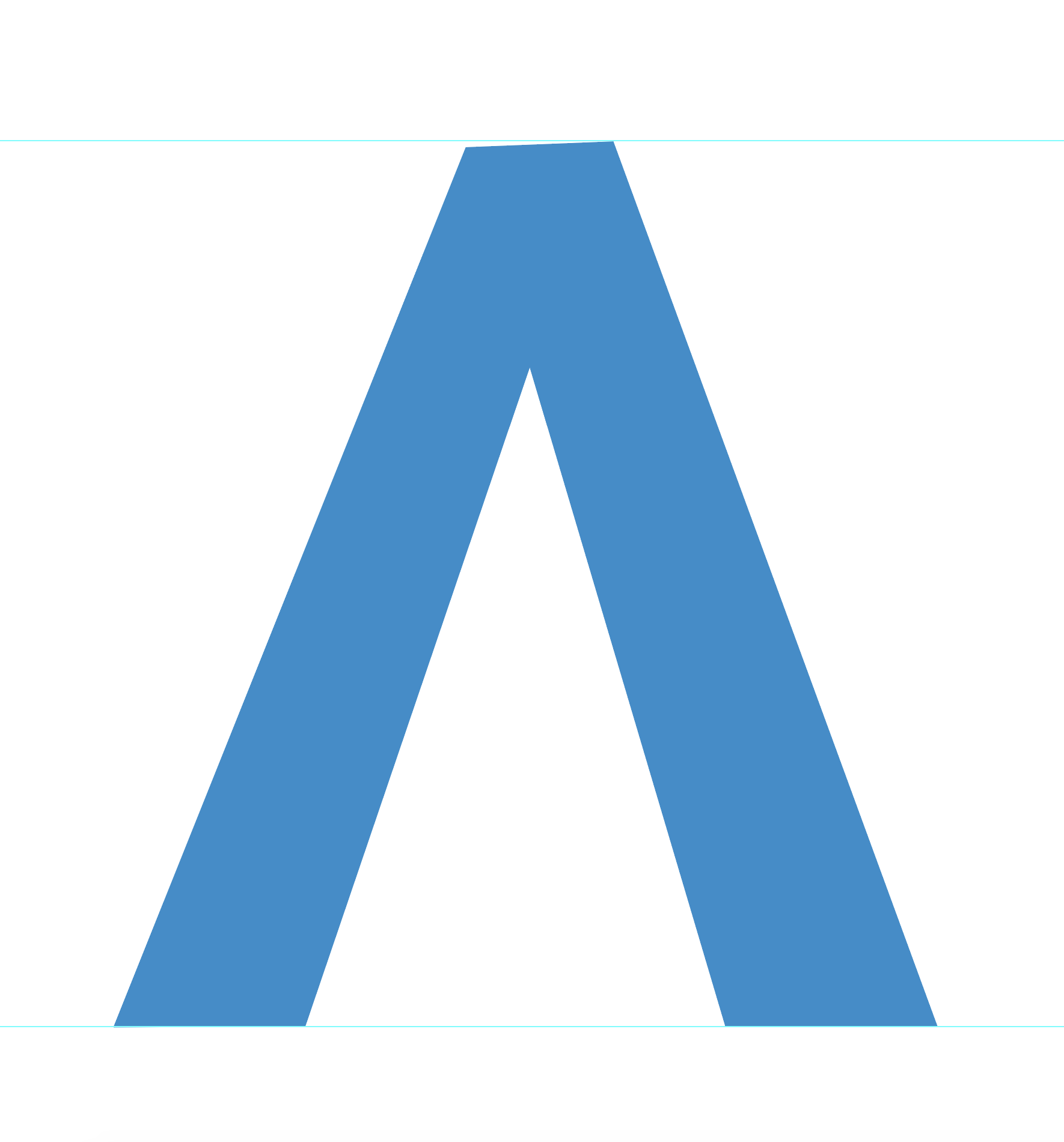
In order to get a better understanding of what is going on with the symmetry, let’s get rid of the ring and isolate just the face of the “A”:
Next, let’s add some guides for alignment and straighten it out so we can see if the top and bottom are level:
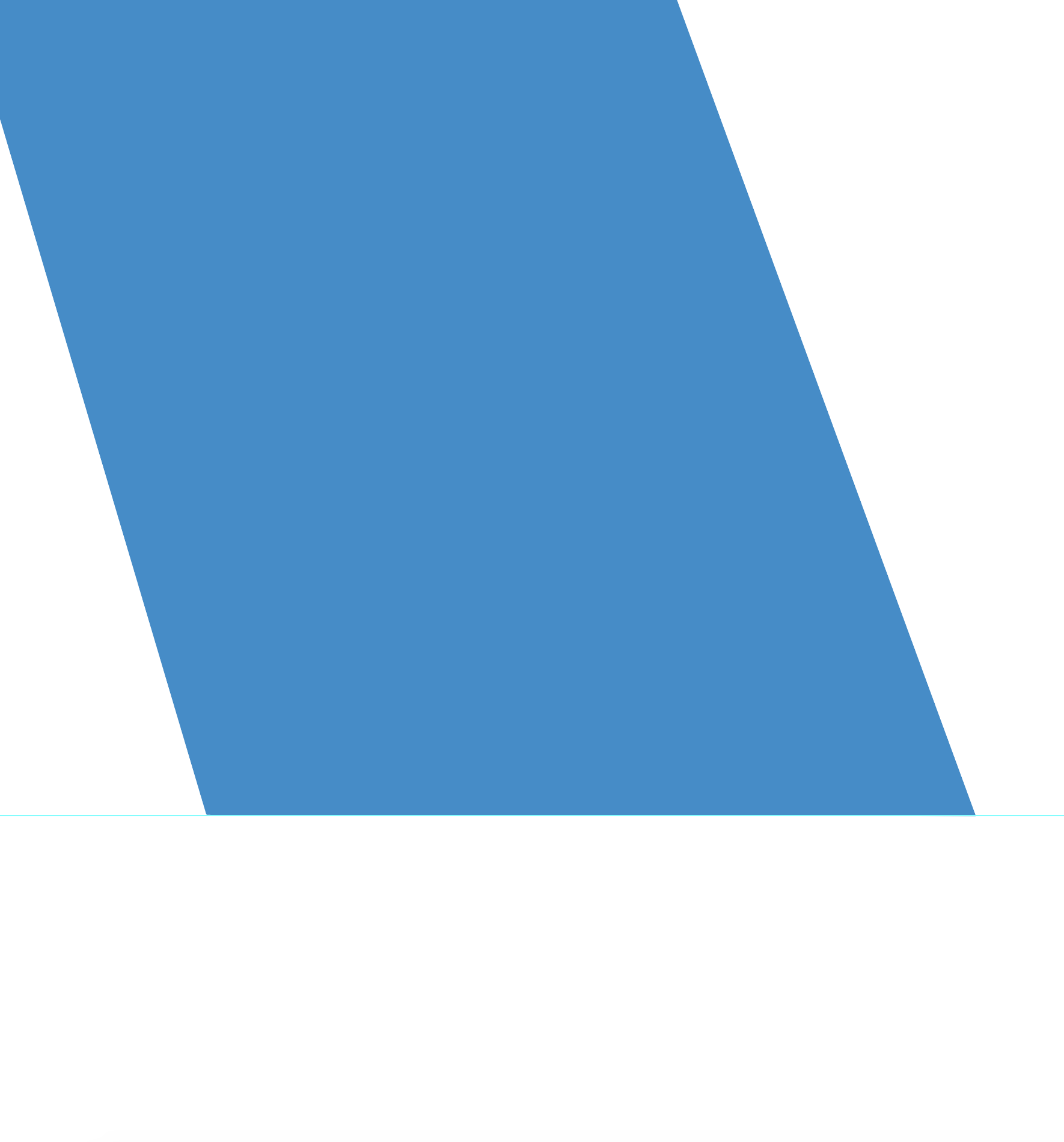
It is already evident that the top of the “A” isn’t quite level. Let’s zoom in to see how askew it really is:
That’s pretty significant if we are going to be using this for a 3D object. Let’s remember this for later when we look at the X-axis perspective.
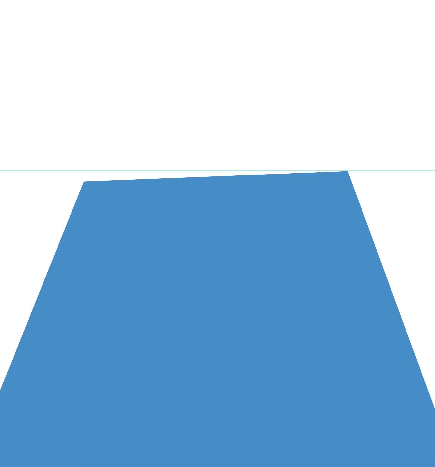
Now let’s check out the bottom of the “A”:
The bottom right looks spot on.
How about the bottom left?
It’s slightly off but it’s minimal (you might have to click the above image to enlarge it in order to see the misalignment).
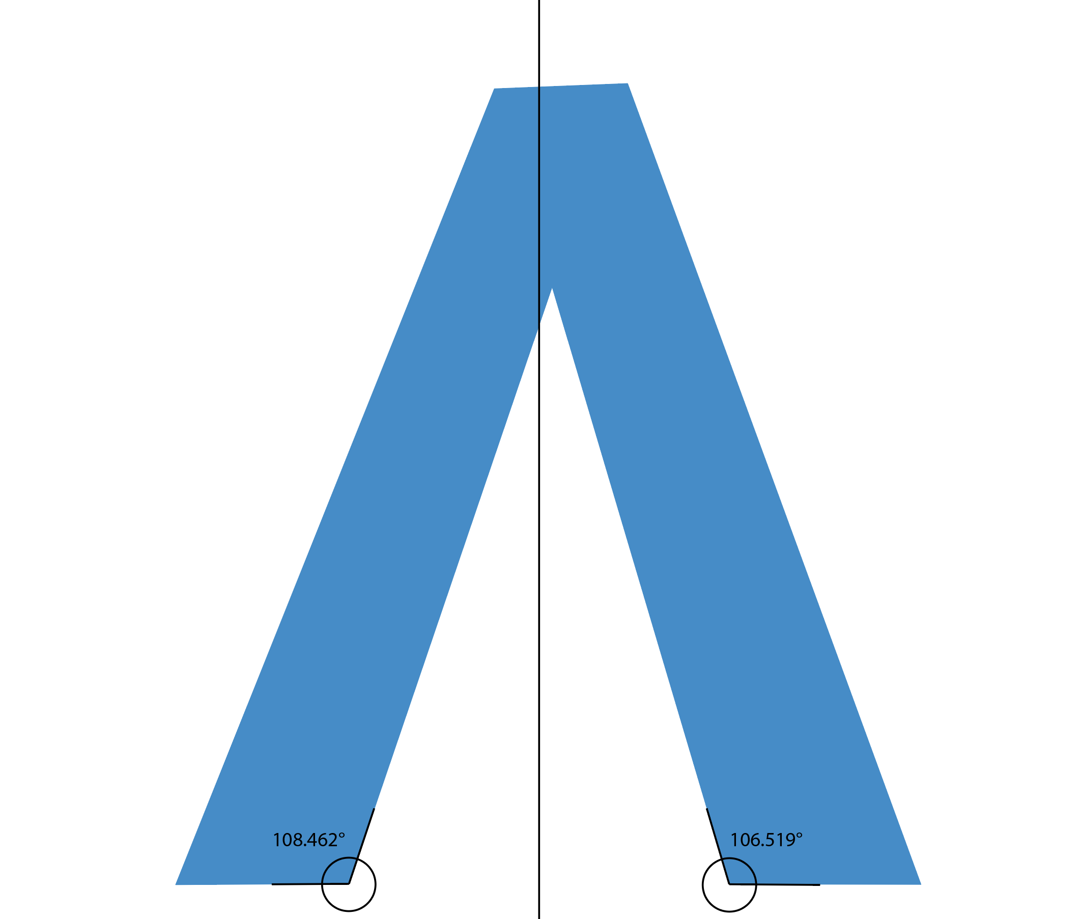
Now let’s fill in the missing sections to restore the original shape of the “A” before it was cut out by the ring.
Looking at the A in this state reveals that it’s quite inconsistent. Let’s use Adobe Illustrator’s trusty measure tool to take some measurements:
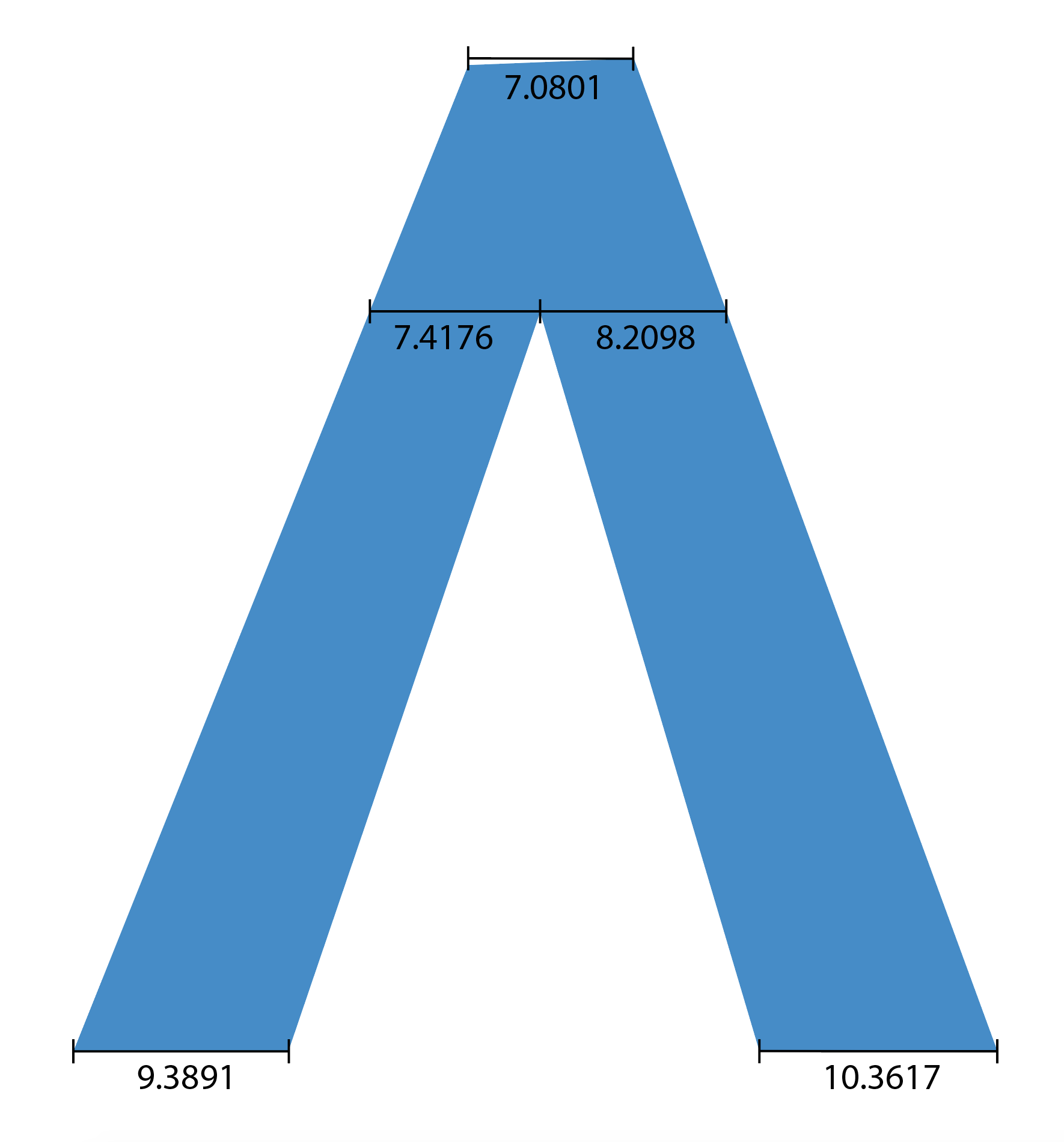
Look at it! Just look at it! 😭
All of these measurements should be the same. Let’s keep this in mind for later when we talk about the Y-axis perspective.
Additionally, let’s check the inner bottom angles of the “A”:
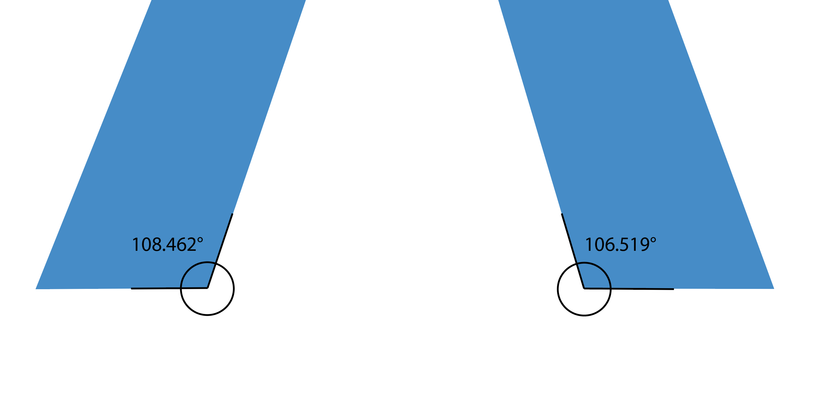
Oh boy, these angles being uneven means the top of the “A” is off-center and lopsided as if the top was pushed towards the right:
In order to fix the symmetry of this shape, we’ll need to make the measurements isometric and equal out those bottom angles. But for now, let’s take a peek at the 3D perspective problems.
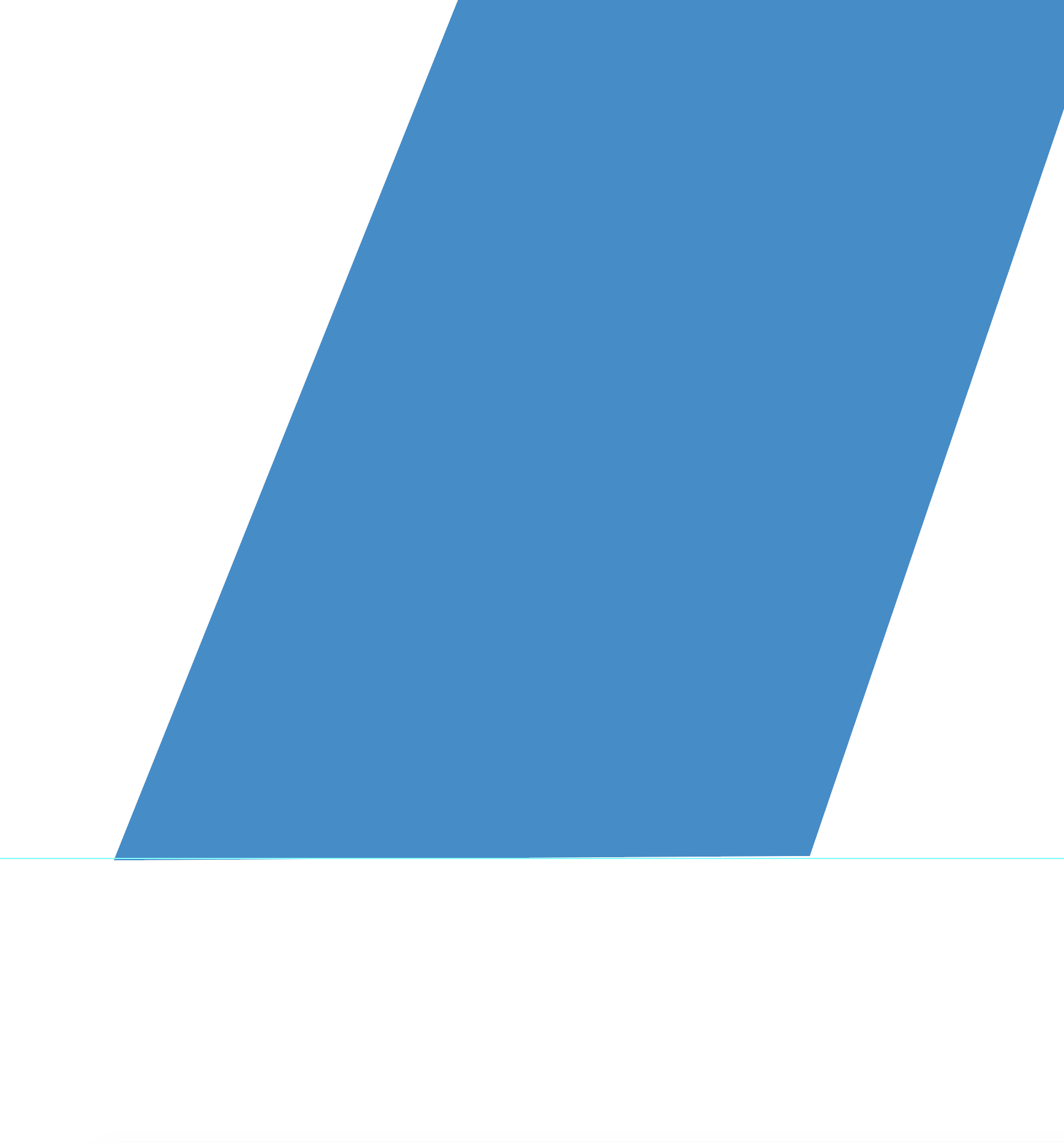
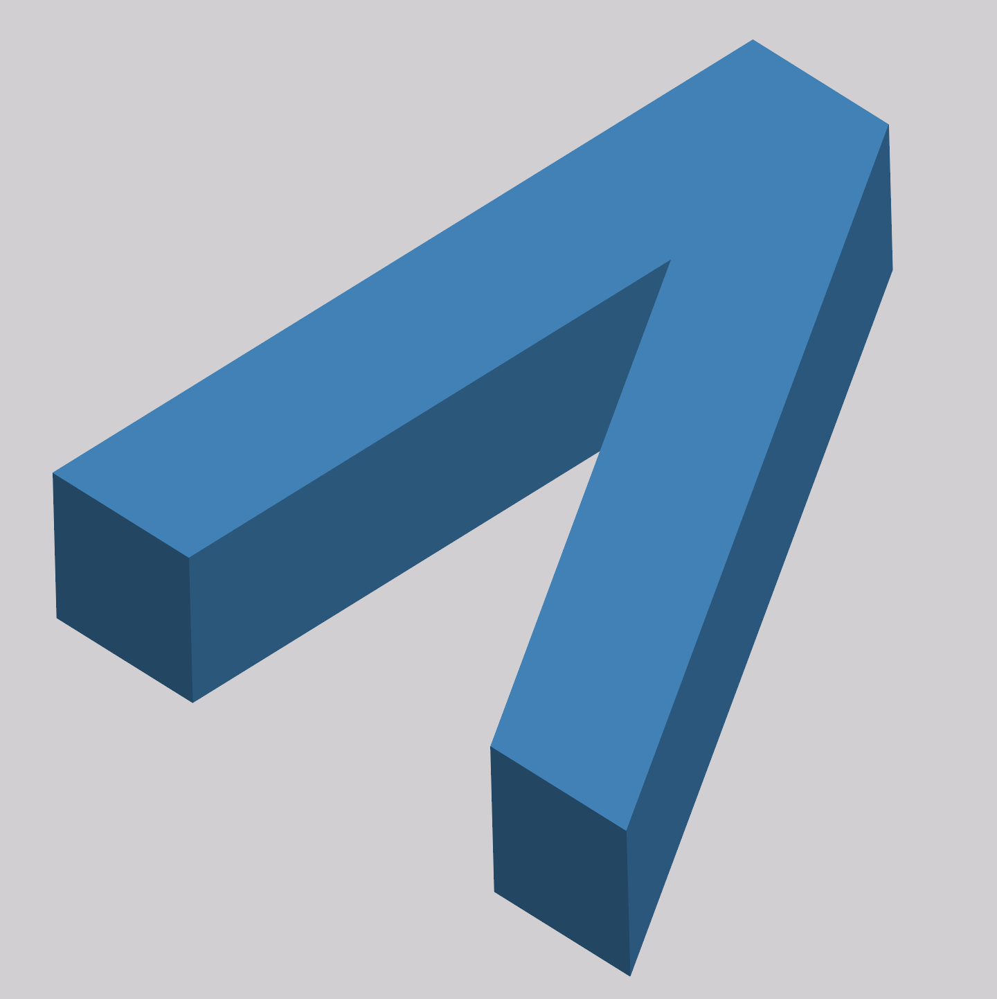
This is the logo again reset to its original state:

Looking closely it’s evident that the 3D extrusion is not realistic nor consistent. Let’s dive in deeper, I’ll try to illustrate what I’m talking about.
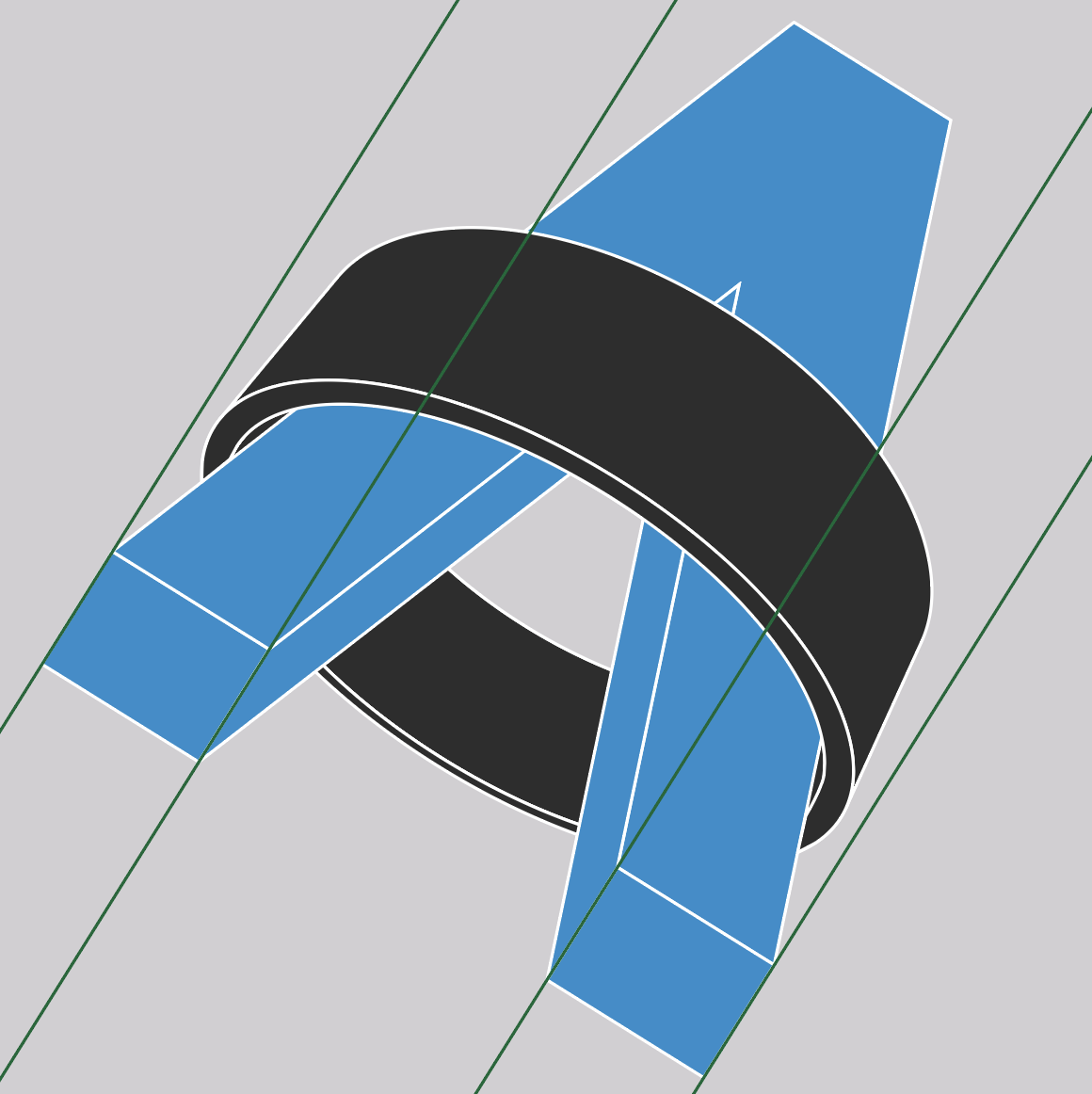
First, let’s start with the X-axis. I’ve added some gridlines that the top and bottom edges of the A should line up with:
We can already start to see some problems here. Going back to those alignment issues we discovered above, we can see how that top edge not being level is affecting the alignment of the shape with the X-axis gridline.
The bottom left of the “A” was only slightly off level but now it’s clear how that minor misalignment also caused an issue with the 3D extrusion.
Let’s move on to the Y-axis:
Similar to the X-axis, we can see some issues here with the Y-axis:
The “A” should be aligned to these gridlines but it’s not as a result of those uneven measurements and angles we discovered earlier.
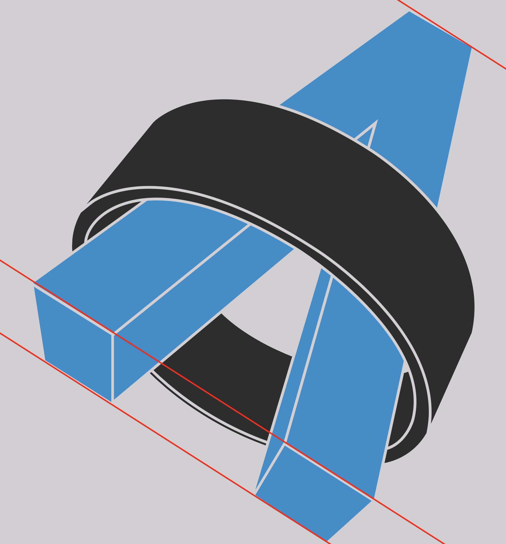
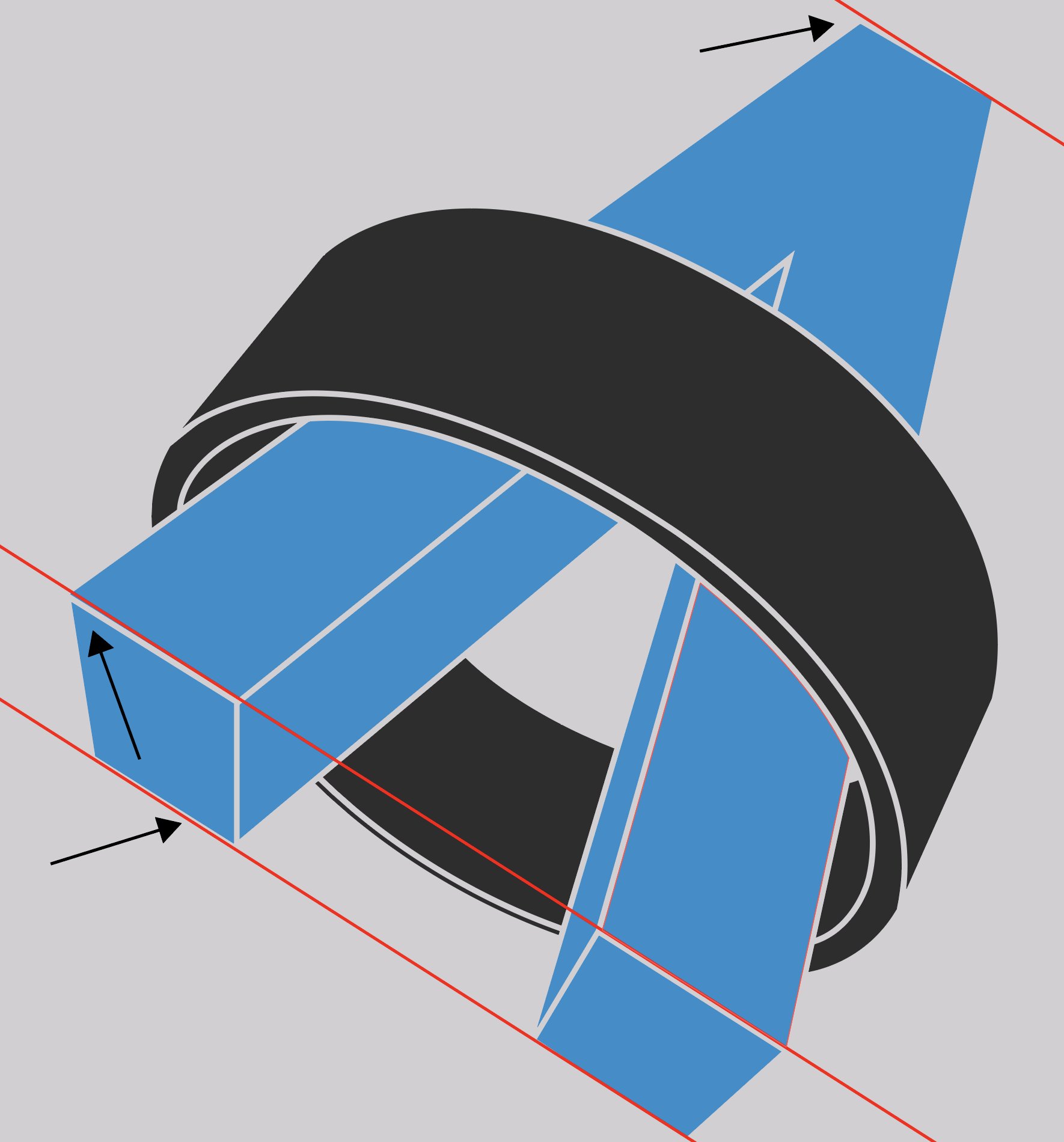
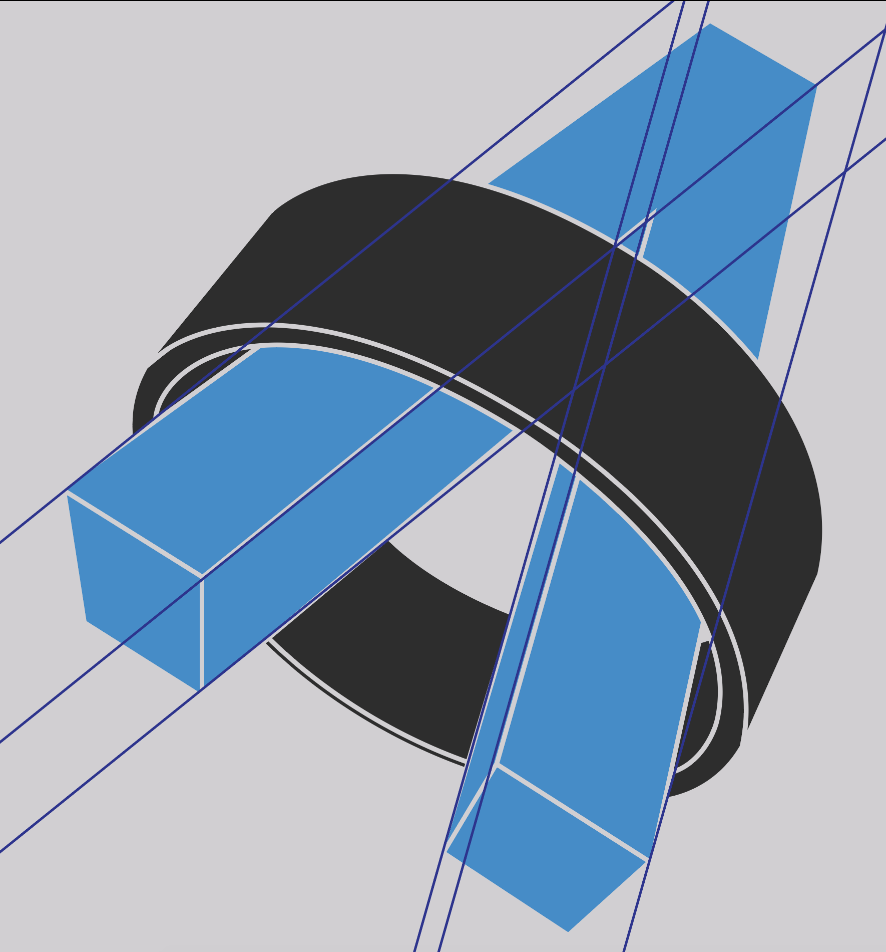
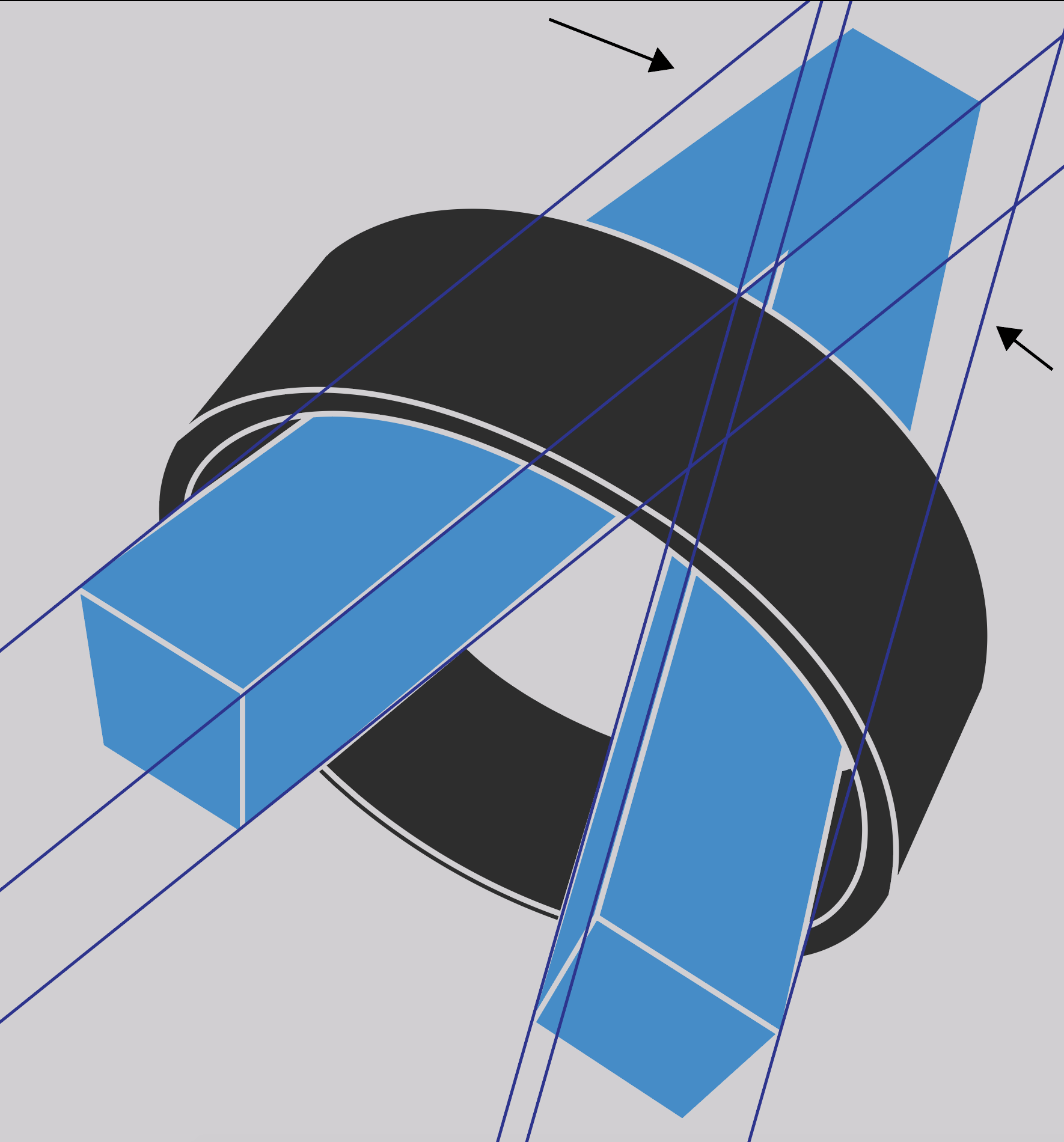
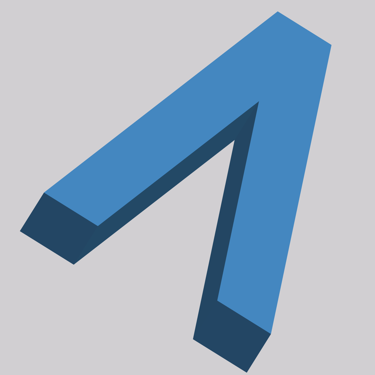
Finally, let’s take a gander at the z-axis:

😲 – shocked
🤯 – mindblown
😭 – crying
This is all wrong. Let me explain:

The extrusion of the left leg’s base doesn’t make sense with how it’s skewed in. The right leg of the “A” appears to be bent down from the left leg along the Y-axis causing a huge deviation from the Z-axis gridlines. This is the main reason for the “3D-ness” not looking realistic.
Fixing
I took some time to recreate the Dradis logo using Adobe Illustrator. I corrected all the perspective and symmetry issues with the current logo design by making those uneven measurements and angles equal.
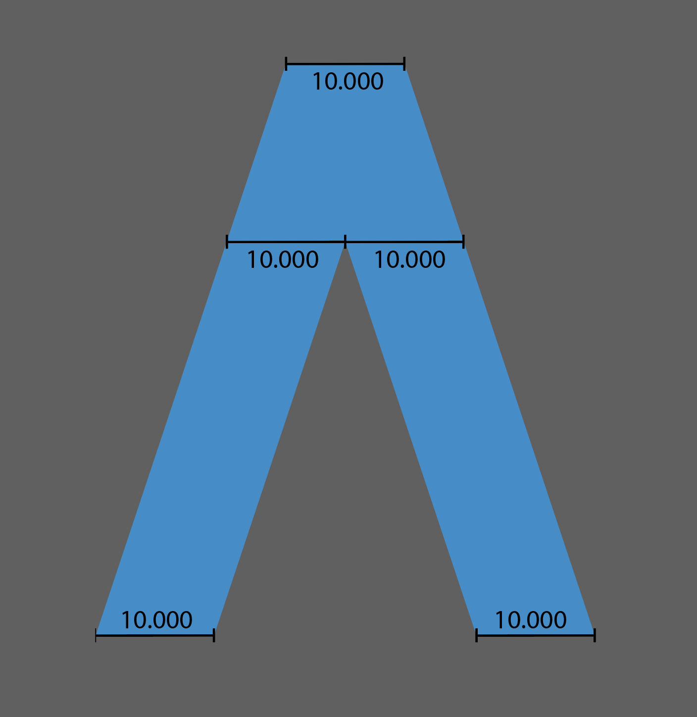
Widths 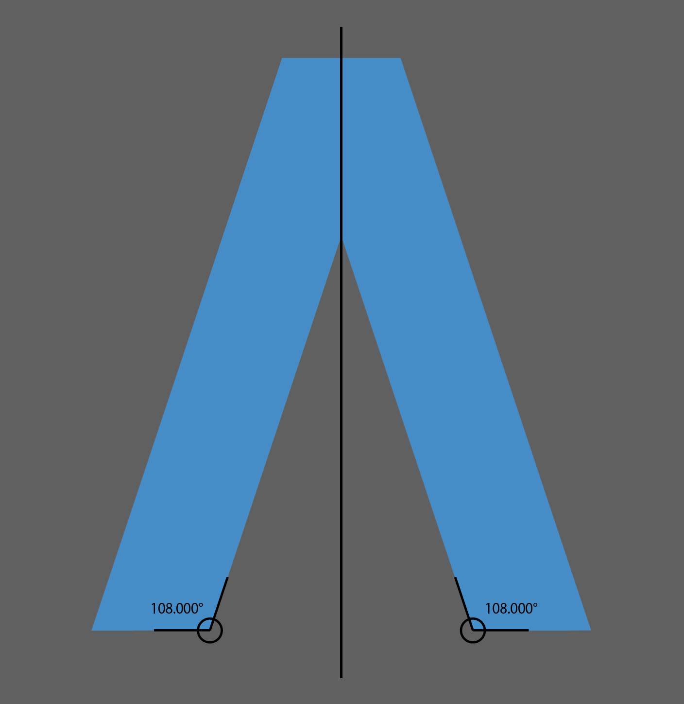
Angles
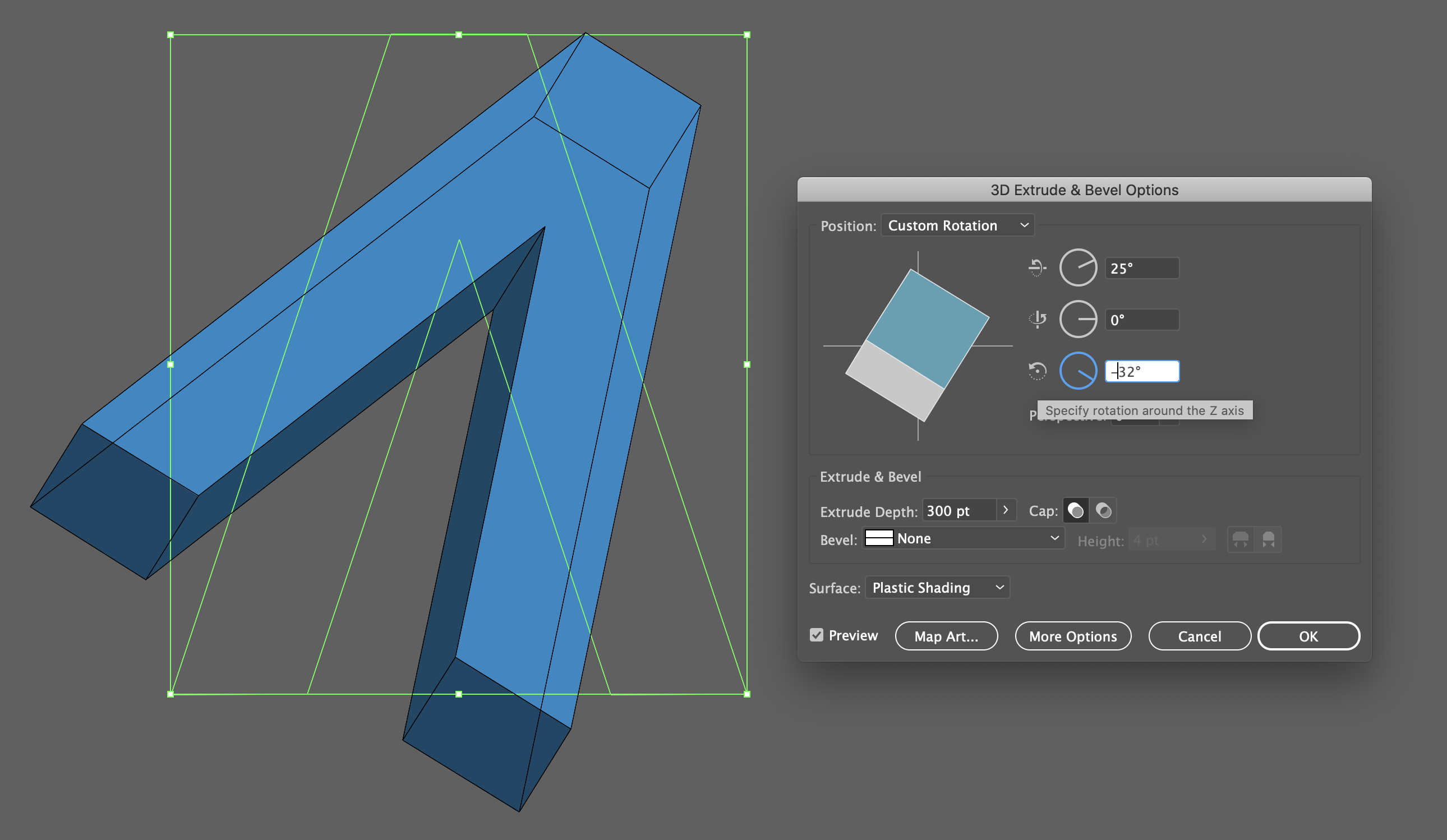
Then I used Illustrator’s 3D tools to make the 3D extrusion and adjust the perspective angle.
I was also able to solve the scaling issue by removing the outlines from the logo and adding shaded colors to the extrusion.
Additionally, I ensured the ring was aligned to the same perspective angle as the “A” to make it look and feel right as one cohesive logo with 2 distinct elements.
The keen observer may say “but the new logo doesn’t align with the Z-axis described above!”:
And they would be right! I like the perspective where we see the flying A’s extrusion on the inner parts of the legs. If we wanted to correct the logo using the original Z-axis angle we would end up with this perspective:
I ended up changing the Z-axis angle to maintain the previous perspective:
Here is the logo again showing the adjusted Z-axis angle:
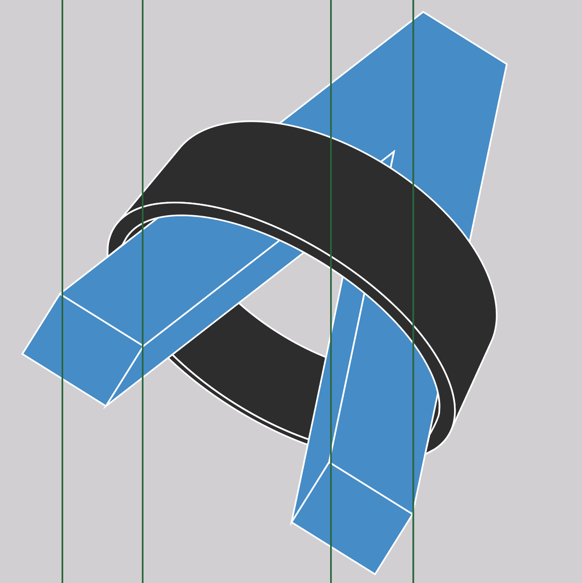
And to be thorough – here are the X and Y gridlines showing how the updated logo is nice and tidy.

Y-axis 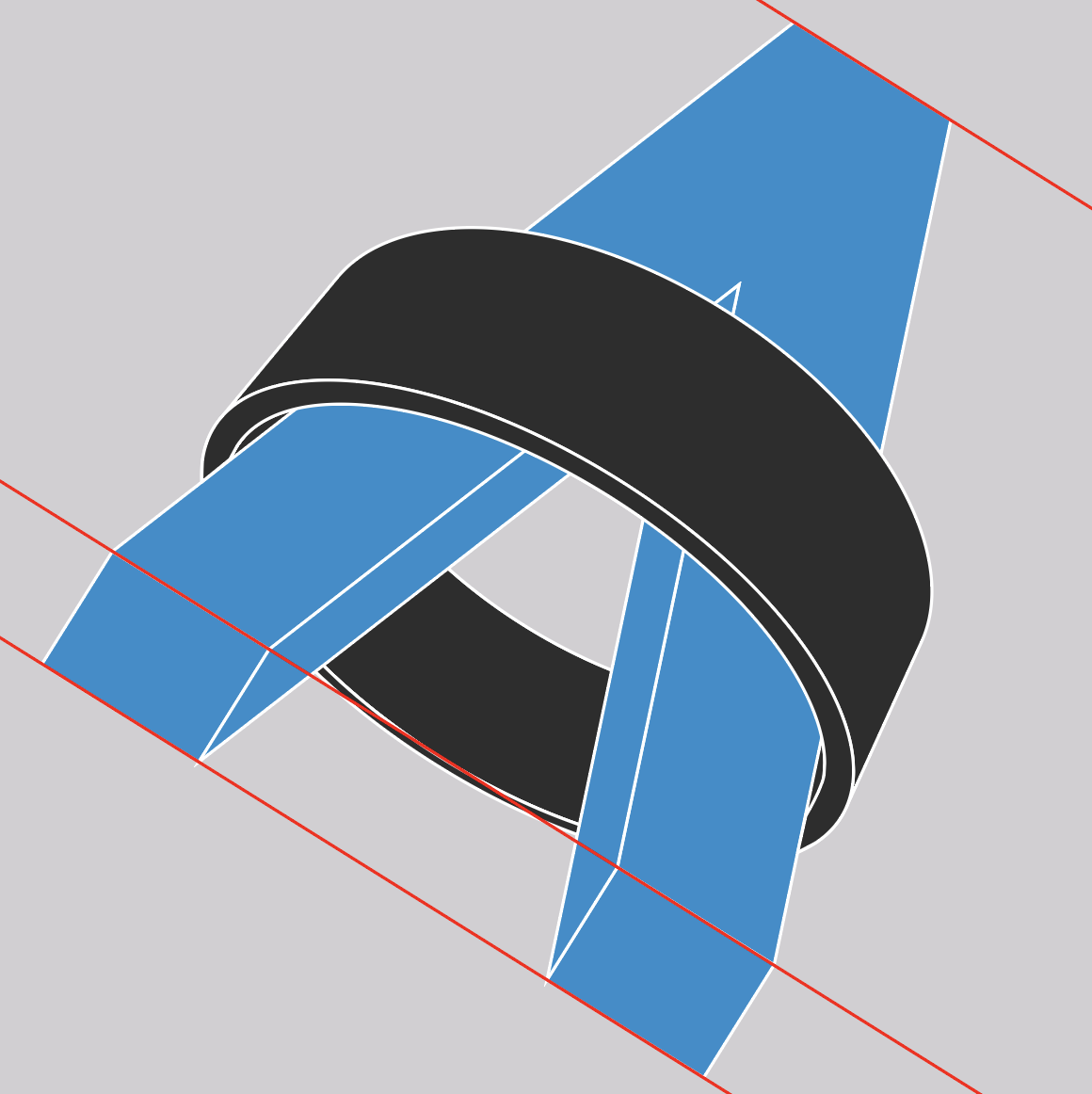
X-axis
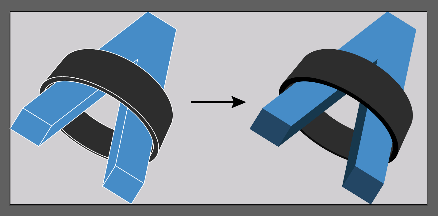
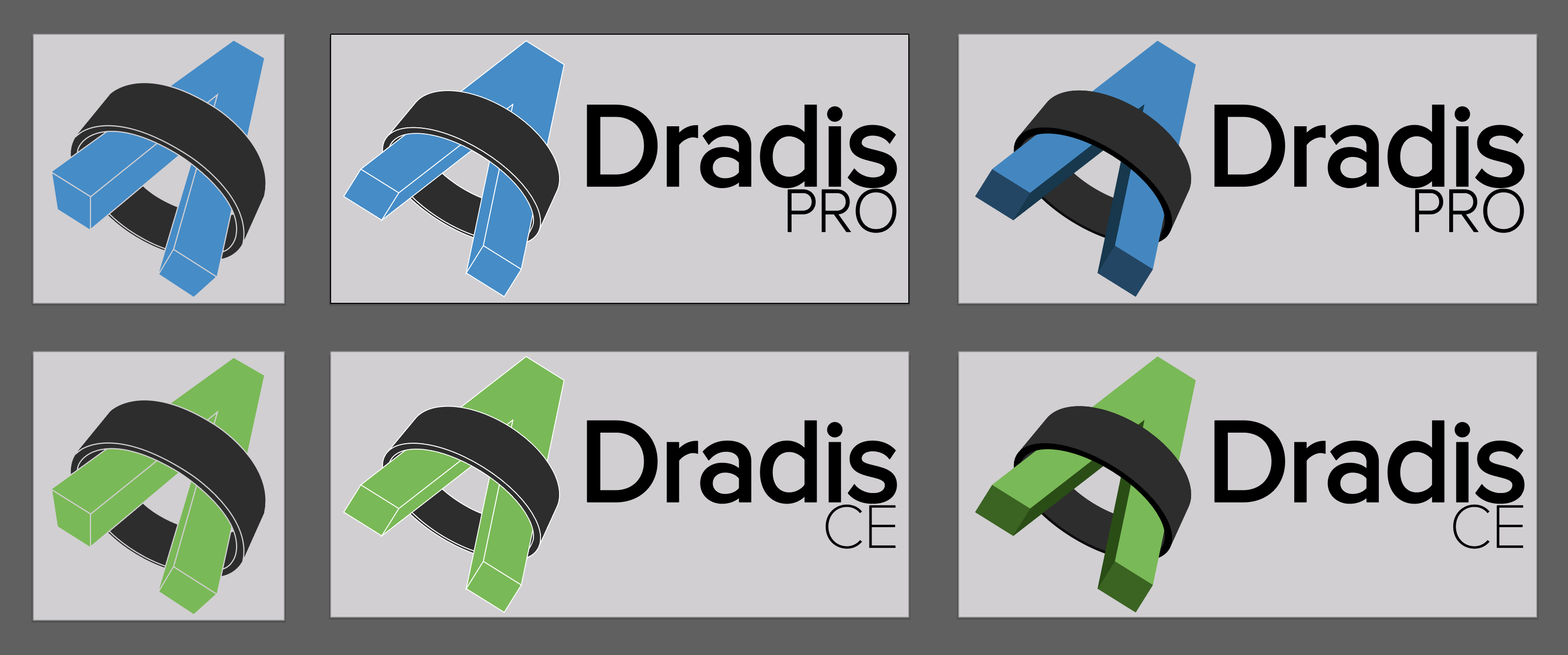
The below shows a comparison of the previous and updated logo designs.
Left: Original logo
Center: Updated logo with corrected perspective
Right: Updated logo with shaded extrusion
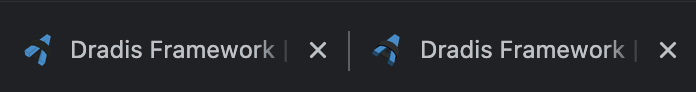
Finally, here is the before and after of the favicon.
Now, the designer in me can rest easy knowing the logo has a realistic 3D extrusion and perfect symmetry.